Mobile Editing - Create a Responsive Website Visually with Elementor Page Builder - Best Webhosting
Thanks! Share it with your friends!
 ULTRAFAST, CHEAP, SCALABLE AND RELIABLE! WE STRONGLY RECOMMEND ACCU
WEB HOSTING COMPANY
ULTRAFAST, CHEAP, SCALABLE AND RELIABLE! WE STRONGLY RECOMMEND ACCU
WEB HOSTING COMPANY

Watch Wordpress Elementor Page Builder Video: Mobile Editing - Create a Responsive Website Visually with Elementor Page Builder.
THIS VIDEO HAS BEEN UPDATED -https://www.youtube.com/watch?v=VPyBuNLpt4U
One of the biggest challenges in web design is getting your design to look perfect across all devices.
We are thrilled to introduce Mobile Editing, a set of features that will give you full responsive control, down to the last pixel, so you can create an astonishing and truly responsive mobile version of your website.
Download Elementor, now with Mobile Editing: https://elementor.com
Heading to big? Set a different size that will only apply to mobile. You can also customize the line height and letter spacing according to device, or change the alignment of any elements to get a better page layout.
And what about spacing issues? With Mobile Editing, you can set margin and padding to get a better fit for smaller screens.
In many cases, columns that are positioned side by side on desktop, appear disordered on mobile. To help you keep the right order, reverse the columns so everything is aligned correctly.
Now, for the first time, you can make your site truly responsive.
Download Elementor today and start designing beautiful mobile websites.
Hi, This is Noa from Elementor, today I’ll give you an overview of our new Mobile Editing options. One of the biggest challenges in web design is getting your design to look perfect across all devices. Which is why we bring you a feature that will give you full responsive control, down to the last pixel, this way beautifying the mobile version of your website.
With the Mobile Editing feature, you can easily change style parameters according to device, Such as font size, line height, padding, margin etc.
Note that whenever you see a small desktop icon displayed by a certain setting - this means you’ve got full control over its responsiveness. If you click on this icon, 2 more icons will appear - the tablet and mobile icons. And if you click on one of them, notice how the web page preview adjusts itself accordingly.
Same goes for the button you already know down here. If you click on a tablet or mobile display, the tablet and mobile icons will automatically appear.
Not only that, but when you switch between the devices, notice how the page scrolls to the exact spot which you’re editing.
Here I’ll add an eye catching heading.
It looks great on desktop, but when I go to the mobile view it’s too big. We can fix this easily by clicking on the mobile icon and in the mobile settings, reducing the font size. Now the heading has different sizes for mobile and desktop. This ability to control mobile size is available for all text elements in Elementor
Here I have a homepage with a 3 section feature area. The image position interchanges, at first appearing in the right, then left, then right again. Watch what happens when I switch to mobile view. Because of the order of the columns, the image appears on top for the first and third sections, and at the bottom for the second section.
To fix this, I go to section - advanced - Column Order, and reverse the order for the second section.
So this is the first addition we have added, reverse column order. As you can see all images are now on top of the text.
While we are on mobile view, notice that we've also added the ability to edit the content in the sections and columns, in addition to changing the widget settings.
Let's make a small change and align the images to the left, and the text to the right. Now, when I go to mobile, because each image and text widget take are divided to different sections, the alignment doesn't look that great. That is why we've added the ability to change the alignment for mobile. I go to the widget setting, and for the image and text go to mobile, and align to center.
Now let's add a large eye catching heading to the page. This looks great on desktop, but when I go to mobile view the heading breaks and is too big. We can fix this easily by pressing the desktop icon, going to mobile settings and reducing the font size. Now the heading has different sizes for mobile and desktop. This ability to control mobile size is available for all text elements in Elementor.
Now let’s take a look at this eye catching heading. It looks great on desktop, but when I go to the mobile view it’s too big. We can fix this easily by clicking on the mobile icon and in the mobile settings, reducing the font size. Now the heading has different sizes for mobile and desktop. This ability to control mobile size is available for all text elements in Elementor.)
The line height and letter spacing can also be set to different sizes for mobile.
Another feature we've added is the ability to set different margin and padding sizes just for mobile. If we add a side padding to the heading here, again, it takes too much space on mobile view. I go to advanced, and set the padding as 0 for the mobile.
Related Videos
-

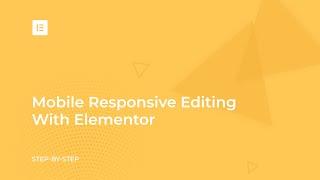
How to Make Your Website Responsive With Elementor's Mobile Editing Tools
Added 98 Views / 0 LikesResponsive Web Design means making your website look good on all devices (desktops, tablets, and mobile phones). Get Elementor, free forever, including mobile editing: https://elementor.com In this video, we show five ways in which you can use the Free Elementor Page Builder for WordPress to edit any site and make it 100% mobile responsive. The methods we cover include: - Mobile font size - Reverse columns - Responsive column width - Padding and margi
-
Lesson 4: Mobile Responsive Editing With Elementor
Added 77 Views / 0 LikesWelcome to the Elementor Getting Started Course. In this short video series, you'll learn the basics of using Elementor. We will cover all you need to know to streamline your workflow and easily create landing pages using the power of Elementor. Things you'll learn in this course: • Overview of Elementor • Building a Landing Page step-by-step • Responsive design with Elementor • Save your work as a template to reuse across your site • Publish your pag
-
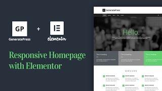
How to Create a Responsive Homepage With GeneratePress & Elementor Page Builder
Added 77 Views / 0 LikesLearn how create a responsive WordPress homepage web design with the free GeneratePress theme and Elementor page builder. Download Elementor [FREE]: https://elementor.com Download GeneratePress [FREE]: http://www.generatepress.com Follow us on Facebook: https://www.facebook.com/elemntor, and Twitter: https://twitter.com/elemntor In this video we also cover some other helpful topics, like creating a pricing table, customizing the template to fit your s
-
Popular
How to Make Your Website Responsive With Elementor Page Builder
Added 105 Views / 0 Likes- Adjust widget and text properties for mobile devices - Resize and reposition columns - Hide widgets, columns and sections for specific types of devices - Overcome position: absolute and position: fixed issues - Use Inline Width to create flexible mobile layouts • Subscribe to ONE with a 10% discount! Use the promo code: • webinar10 https://one.templatemonster.com/ ~~~ Get the Best Elementor Themes, Templates and Add-ons: https://www.templatemonster.
-
Popular
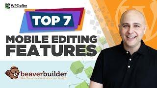
7 Beaver Builder Mobile Editing Tricks That You Might Not Know About
Added 113 Views / 0 LikesDo you love Beaver Builder? If you do then you will love these 7 overlooked mobile editing features that you can start using right now to build beautiful WordPress websites. Link: https://www.wpcrafter.com/beaverbuilder
-
Elementor Page Builder Tutorial - How To Create A Wordpress Website 2017
Added 94 Views / 0 LikesTake The Wordpress Course With Elementor Here: https://www.udemy.com/how-to-make-a-wordpress-website-2017-elementor-builder/ In this udemy course, i go over how to make a wordpress website with the new elementor page builder. The elementor page builder allows for really easy drag and drop and copy and paste. this is a complete tutorial on the elementor page builder and makes it really simple and easy to create a wordpress website. The course is on ude
-
How to Create a Countdown Timer Module on Your Website with Elementor Page Builder?
Added 87 Views / 0 LikesWhen you look at the product you are interested in a countdown timer, measuring hours to the end of sale – have you felt you need to buy it before the time goes out? If yes – they got you. Don’t worry, you are not alone who was caught on such a simple trick. Marketers invent thousands of such strategies to make a customer buy something. We described the mechanism of its work in this article (https://www.templatemonster.com/blog/create-countdown-timer-
-
Responsive Image Sliders with Elementor Page Builder
Added 93 Views / 0 Likes• Subscribe to ONE with a 10% discount! Use the promo code: • webinar10 https://one.templatemonster.com/ ~~~ Get the Best Elementor Themes, Templates and Add-ons: https://www.templatemonster.com/elementor-marketplace/ Get Monstroid2 Modular Constructor Elementor WordPress Theme: https://www.templatemonster.com/wordpress-themes/monstroid2.html ~~~ Follow ONE Community on Social Media: https://www.facebook.com/groups/ONE.by.TemplateMonster/
-

Responsive Editing & Hover Editing For Divi, Plus Native Srcset Support For Responsive Images
Added 89 Views / 0 LikesLearn more here: https://www.elegantthemes.com/blog/theme-releases/responsive-editing-hover-editing-for-divi Today we are excited to introduce Responsive Content and Hover Content to Divi, including native SRCSET support for responsive images. This update allows you to serve different content to visitors based on which device they are using to browse your website, giving you even more fine tuned control over your responsive designs. Responsive editing
-
Popular
How To Create A Conversion Focused Blog Page With Elementor Page Builder
Added 110 Views / 0 LikesIn this video, I'll show you how to create a conversion focused blog page that will help you connect better with your visitors and make your website stand out. STUFF REFERENCED IN THIS VIDEO Elementor https://www.wpcrafter.com/elementor Elementor Extras https://www.wpcrafter.com/eextras JetBlog https://www.wpcrafter.com/crocoblock (referral) Astra Theme https://www.wpcrafter.com/astra
-

Elementor Design With Gradients - Create Stylish Feature Boxes With Elementor Page Builder
Added 87 Views / 0 LikesIf you want to create modern designs using Elementor, then in this video I will show you how to use gradients to captivate your visitors. More info: https://www.wpcrafter.com/elementor-page-builder Today Elementor released a new feature. Now I have never been so excited about a new feature like this before. If you have a guess with that new feature is, it's gradients! Gradients are one of the most popular design trends going on right now. In fact you
-
Popular

How To Build A WordPress Website Page With Elementor Page Builder Plus Free Download
Added 104 Views / 0 LikesHow To Build A WordPress Website Page With Elementor Page Builder Yesterday I felt inspired to see what Elementor page builder could do, so I set out to re-create a very popular website. Now normally to build something like this would require a lot of custom code and just wouldn't be possible for normal people with normal lives. But with Elementor page builder, I was able to build this website in 40 minutes. So if you want to know how to build a websi