How to Optimize Your Ecommerce Store for Mobile Devices | The Journey - Best Webhosting
Thanks! Share it with your friends!
 ULTRAFAST, CHEAP, SCALABLE AND RELIABLE! WE STRONGLY RECOMMEND ACCU
WEB HOSTING COMPANY
ULTRAFAST, CHEAP, SCALABLE AND RELIABLE! WE STRONGLY RECOMMEND ACCU
WEB HOSTING COMPANY

Watch WebHosting GoDaddy Video: How to Optimize Your Ecommerce Store for Mobile Devices | The Journey.
What does your online store look like on a smaller screen? With almost 55 percent of users accessing the internet solely on their smartphones, ecommerce transactions are increasingly taking place on smaller devices. Check out more The Journey content at https://bit.ly/GDTheJourney.
✅ Read about it on our blog ➜ https://bit.ly/3FGgBR6GoDaddy
⏰TIMESTAMPS⏰
00:00 – Introduction
00:39 – Focus on the user experience
01:06 – Build a mobile-first website
01:49 – Use clear and simple navigation
02:27 – Optimize your product listings
02:53 – Reduce checkout steps
03:33 – Final thoughts and tips
It’s important to consider ecommerce on smartphones, so let’s take a look at how to best optimize your online store.
Focus on the user experience
In Google’s own words: “Focus on the user and all else will follow. With this in mind, we seek to design experiences that inspire and enlighten our users.” Simply put, if your user has a poor experience on your website, then you won’t be shown to those who are searching Google for your products and services.
Build a mobile-first website
When building any kind of website, you have to think about it through the lens of “Mobile First,” which can be difficult because you will most likely be building it on a laptop or desktop computer. Consider using a website-building tool that is specifically mobile-optimized right from the start. There are many mobile-optimized layouts and designs you can choose that are made to look good on both large and small screens and maintain that optimization as you customize.
Use clear and simple navigation
A good mobile site has a clear and simple navigation. Add your primary CTAs (calls-to-action) to your navigation bar to make sure they are easy to access, even by someone with large thumbs or long fingernails on their tiny touch screen. You’ll also want to organize your products into categories to make it easy for customers to click and browse.
Optimize product listings
Make sure all images link somewhere and all links and buttons work. Be sure all listings show a product image, price and buy button above the scroll line at the top of the page. You want to make sure the most important information is visible without having to scroll down the page.
Reduce checkout steps
More steps mean more opportunities to abandon the process and buy somewhere else that is easy and familiar (like Amazon). Collect necessary information like first and last name, email address and phone number and avoid anything that is unnecessary. You can always follow up after the purchase is made with an email asking for other information you may want to collect.
Optimizing a website or ecommerce store for smartphones isn’t expensive. In fact, it’s all about streamlining and minimalism. How can you organize your design so that it loads quickly and is easy to navigate?
The Journey is what everyday entrepreneurs, like you, need to follow in the pursuit of online success. Our experienced GoDaddy Guides are here to take you through all the steps, both big and small, that you encounter every day.
Want to learn about more ways to grow your business? Subscribe to GoDaddy on YouTube: http://bit.ly/GoDaddy-Subscribe
GoDaddy links:
https://www.godaddy.com
https://www.youtube.com/godaddy
https://www.instagram.com/godaddy
https://www.facebook.com/godaddy
https://www.twitter.com/godaddy
#ecommerce #mobile #website #godaddy #thejourney
Related Videos
-

How to Generate Returning Sales on Your eCommerce Store | The Journey
Added 19 Views / 0 LikesHappy customers are the key to a successful business. And if you want to keep yours happy, then you’ll need to implement a few customer loyalty program ideas that keep them coming back for more. Check out more The Journey content at https://bit.ly/GDTheJourney. ✅Read about it on our blog ➜ http://bit.ly/2RCqFb1GoDaddy 0:13 How to generate returning sales on your ecommerce store 1:20 Embrace open communication 2:37 Provide stellar customer service 4:16
-

Advanced Ecommerce Features to Add to Your Online Store | The Journey
Added 16 Views / 0 LikesIf you know how start an online store the right way, you’ll be able to boost your profits significantly and grow your business year after year. Creating an eCommerce business is easier than you might think, and we’re going to show you how to build an online store like a pro. Here are seven advanced e-commerce features to consider adding to your online store. Check out more The Journey content at https://bit.ly/GDTheJourney. ✅ Read about it on our blog
-
Popular

Optimize Your Divi Website For All Devices
Added 102 Views / 0 LikesAlthough Divi has great automatic responsive behaviour. You can optimize it even more manually. In this video I show you how to optimize your Divi website for desktops, tablets and smartphones!
-

7 - Optimizing Your Website for Mobile Devices
Added 36 Views / 0 LikesLearn how to optimize your website for mobile devices. In this lesson, you will learn how to: • Create responsive layouts for your home page, header, and footer • Save templates
-
Popular

Magento. How To Disable Cart On Mobile Devices
Added 103 Views / 0 LikesThis video tutorial is going to show you how to disable mobile cart in Magento template. Choose your Magento template now: http://www.templatemonster.com/magento-themes.php?utm_source=youtube&utm_medium=link&utm_campaign=magtuts226 More Magento Video Tutorials: https://www.youtube.com/playlist?list=PLhQIfRNfwAocfWc4zD0OPccvOuiO58-D6 Subscribe Our Channel: https://www.youtube.com/user/TemplateMonsterCo/ Follow us: Facebook https://www.facebook.com/Temp
-

Google Mobile Friendly Test For Websites - Mobile Optimize To Avoid Mobilegeddon | WP Learning Lab
Added 85 Views / 0 LikesGrab Your Free 17-Point WordPress Pre-Launch PDF Checklist: http://vid.io/xqRL Download our exclusive 10-Point WP Hardening Checklist: http://bit.ly/10point-wordpress-hardening-checklist Google Mobile-Friendly Test For Websites - Mobile Optimize To Avoid Mobilegeddon | WP Learning Lab https://www.google.com/webmasters/tools/mobile-friendly/ In this video you will learn how to test your site for it's mobile-friendliness. Once you know whether your site
-

How to Beautifully Showcase Services on Mobile Devices with Divi
Added 67 Views / 0 LikesIf you are focusing on mobile-first designs, this post might help you out. We’ve created two beautiful examples of service showcases that look great on smaller screen sizes. More so, they were specifically designed to look their best on mobile while still maintaining a good design on the desktop. In this post, we’ll show you step by step how to recreate them from scratch. We hope this tutorial will inspire you to unleash your creativity when designing
-

CherryFramework 4. How To Disable MotoPress Slider On Mobile Devices
Added 86 Views / 0 LikesThis tutorial will show you how to disable MotoPress slider on mobile devices. Cherry Framework 4 Themes from TemplateMonster.com: http://www.templatemonster.com/templates.php?pr=50125-186275utm_source=youtube&utm_medium=link&utm_campaign=chfortuts147 Build Absolutely Anything with Monstroid WordPress Theme: http://www.templatemonster.com/wordpress-themes/monstroid/?utm_source=youtube&utm_medium=link&utm_campaign=chfortuts147 View more Cherry Framewor
-

PrestaShop 1.5.x/1.6.x. Troubleshooter. Theme Does Not Show Up On Mobile Devices
Added 96 Views / 0 LikesThis tutorial shows how to solve the issue with mobile layout, specifically when theme does not show up properly on mobile devices in PrestaShop 1.5.x/1.6.x. To view more our PrestaShop templates go to website: http://www.templatemonster.com/prestashop-themes.php?utm_source=youtube&utm_medium=link&utm_campaign=prshoptuts137 More PrestaShop Video Tutorials: https://www.youtube.com/playlist?list=PLhQIfRNfwAocQcTfOyM0j3LfsskZ3Ip7E Subscribe Our Channel:
-

How To Adjust Divi’s Column Stacking Order on Mobile Devices
Added 85 Views / 0 LikesToday I am going to show you two ways you can change Divi’s column stacking order on mobile Devices. The first involves creating an alternate version of the content specifically for mobile devices using the “Disable On” feature within Divi. The second way is to use custom CSS to add classes to your columns which designate their order on Mobile. Read article: https://goo.gl/ML3PaB
-

The Responsive & Fluid Visual Builder Interface With Improved Support For Mobile Devices and Large M
Added 82 Views / 0 LikesLearn more here: https://www.elegantthemes.com/blog/theme-releases/the-responsive-fluid-visual-builder-interface-with-improved-support-for-mobile-devices-and-large-monitors The power of the Divi lies in the usability, flexibility and customizability of the Visual Builder. It’s not just about what the builder can do, but how easy and enjoyable it is to get those things done as a designer. Today we are making the builder even more flexible by extending
-
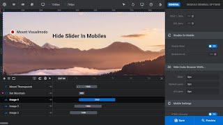
How To Disable The Slider Visibility In Mobile Devices Using Revolution Slider WordPress Plugin?
Added 55 Views / 0 LikesIn today's video tutorial we'll learn a simple, easy, and fast method to hide your slideshow into mobile devices using Revolution slider premium WordPress plugin in their latest versions. In addition, we'll learn a simple method to disable the visibility of single slider contents/layers in mobile devices too. Download WordPress themes https://visualmodo.com/ How To Edit Revolution Slider 6 WordPress Plugin Elements In Responsive Screens https://www.y